Machine Learning Mini projects
A set of mini projects implementing machine learning concepts in Python and MATLAB
Feature Selection based on Information Theory
Finding the most informative dimensions (pixels) of face images, given a dataset of two classes of males and females images. The most informative pixels are demonstrated by a heatmap of informativeness scores
Binary Classification: Naive Bayesian Classifier, K-Nearest Neighbors (KNN), and Logistic Regression
Employing three different classification algorithms to classify images into two male and female classes. It is shown that logistic regression works slightly better than the other two approaches
Principal Component Analysis (PCA)
Conducting Principal Component Analysis (PCA) on a dataset of face images to find the principal directions. The analysis shows that by keeping the top 50 dimensions, we can pretty much capture all the information in the dataset.
Density Estimation with KDE and GMM
First, running PCA on 13-dimensional “Wine Quality” dataset to reduce the dimension to two and visualize the multi-modal behaviour. Then, using the Expectation-Maximization (EM) algorithm to fit a Gaussian Mixture Model (GMM) to the data and comparing the results with Kernel Density Estimation (KDE) and Histogram
K-Means Clustering
A Simple K-Means Clustering Test
Every project has a beautiful feature showcase page. It’s easy to include images in a flexible 3-column grid format. Make your photos 1/3, 2/3, or full width.
To give your project a background in the portfolio page, just add the img tag to the front matter like so:
---
layout: page
title: project
description: a project with a background image
img: /assets/img/12.jpg
---
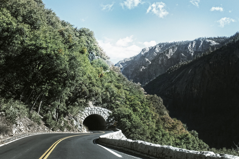
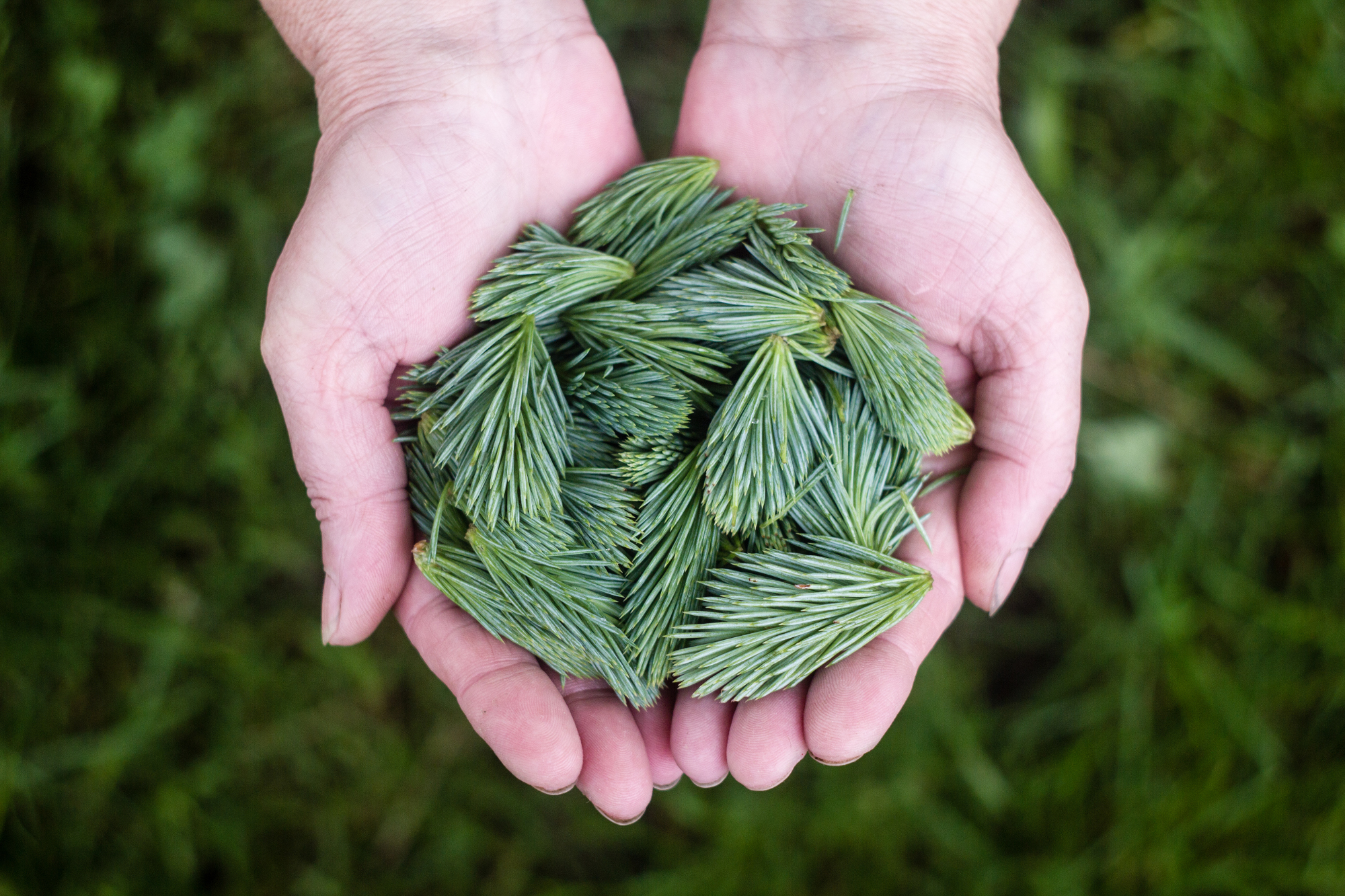


You can also put regular text between your rows of images. Say you wanted to write a little bit about your project before you posted the rest of the images. You describe how you toiled, sweated, bled for your project, and then… you reveal it’s glory in the next row of images.
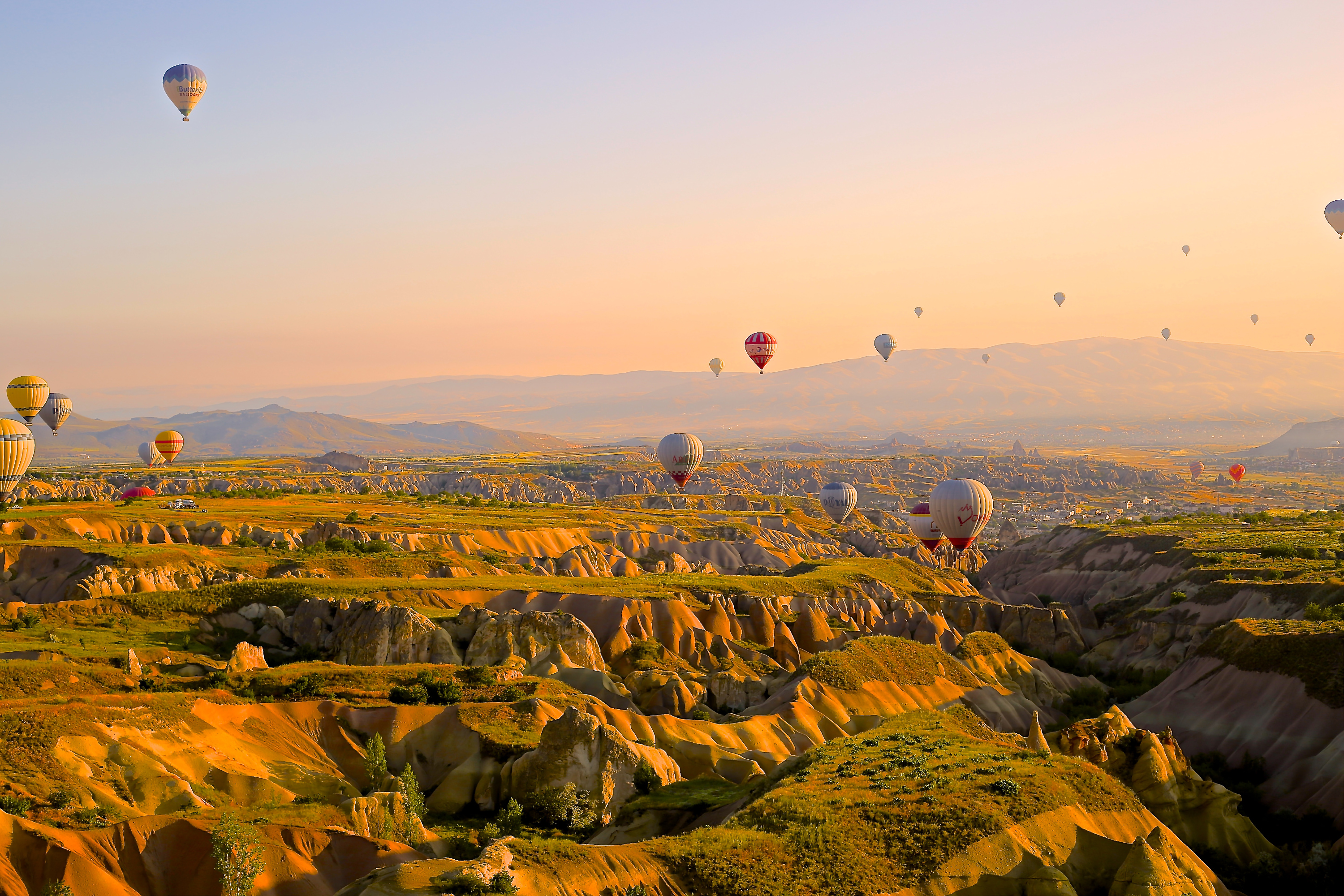

The code is simple.
Just wrap your images with <div class="col-sm"> and place them inside <div class="row"> (read more about the Bootstrap Grid system).
To make images responsive, add img-fluid class to each; for rounded corners and shadows use rounded and z-depth-1 classes.
Here’s the code for the last row of images above:
<div class="row justify-content-sm-center">
    <div class="col-sm-8 mt-3 mt-md-0">
        <img class="img-fluid rounded z-depth-1" src="/assets/img/6.jpg" alt="" title="example image"/>
    </div>
    <div class="col-sm-4 mt-3 mt-md-0">
        <img class="img-fluid rounded z-depth-1" src="/assets/img/11.jpg" alt="" title="example image"/>
    </div>
</div>