D3 Visualizations
Using D3.js to visualize data; binding data to DOMs; applying data-driven transformations
As a part of class project in CSE6242, applied D3.js for data visualization to bring data to life using HTML, SVG, and CSS. Below shows some of these mini projects:
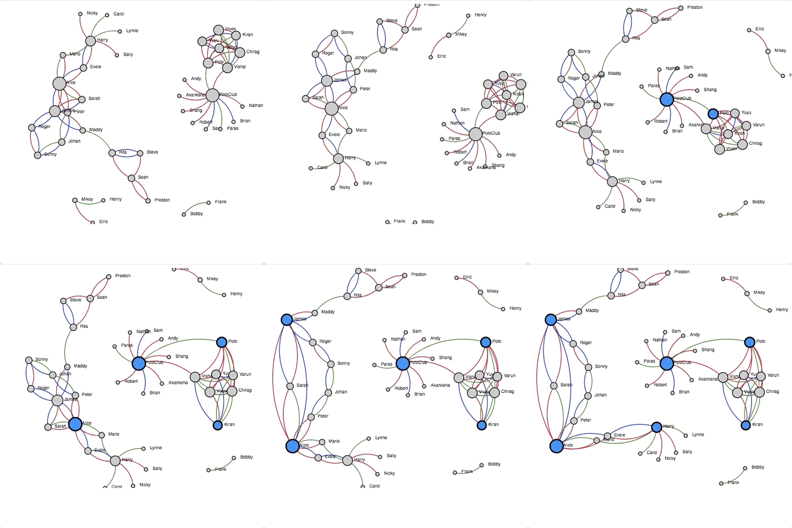
(1) Visualize a force-directed network graph
This D3 visualization demonstrates a connection directed graph representing Twitter followers relation. The animation (left) shows a brief presentation and on the right you can try a live demo, where you can move nodes or freeze/unfreeze them by double-clicking on them!

Try the live demo in external page
(2) Visualizing Hierarchical Data with a Dendrogram
This D3 visualization portrays a hierarchical data stored in a json file derived from Sushi Preference Data Sets.
The animation (left) shows a brief presentation and on the right you can try a live demo, where each node is collapsible, i.e. when you click on a node, it expands its children if they are not currently displayed and hides them if they are.

Try the live demo in external page
(3) Heatmap and Select Box
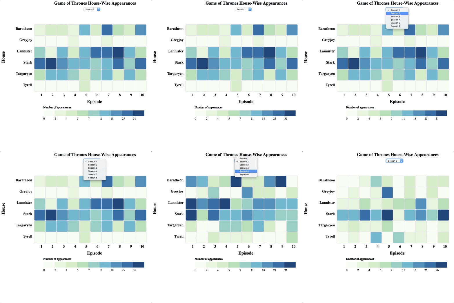
This D3 visualization demonstrates a heatmap of the number of appearances of characters from each house for each season of HBO’s Game of Thrones.
The animation (left) shows a brief presentation and on the right you can try a live demo, in which a drop down select box with includes the season numbers (1 to 6) in ascending order. When the user selects a different season in this select box, the heatmap and the legend both will be updated with values corresponding to the selected season.

Try the live demo in external page
(4) Interactive visualization
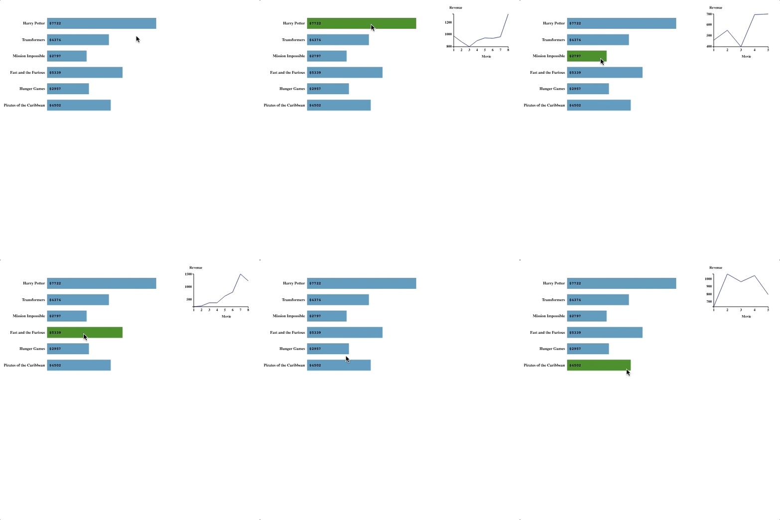
This D3 visualization demonstrates an interactive bar chart. Each line in the data file represents a movie franchise and the revenue in millions for each movie in that franchise. The horizontal bar chart has vertical axis denoting the movie franchise names and the horizontal axis denotes the total revenue (in millions) for all the movies in the franchise. Also, each bar shows the total revenue (in millions) labelled inside. On hovering over a bar, a smaller line chart representing the revenue for each movie will be displayed on the top right corner.
The animation (left) shows a brief presentation and on the right you can try a live demo.

Try the live demo in external page
(5) Choropleth Map of World Population
This D3 visualization exhibits how to integrate information from various resources, such as TopoJSON topology containing geometry collections for every country, to create an interactive choropleth map.
The animation (left) shows a brief presentation and on the right you can try a live demo.

Try the live demo in external page
(5) Choropleth Map of World Population
This D3 visualization presents a visualization of the Wine Quality Dataset. The dataset provides the quality values based on eight red wine chemical features. The symbol properties, such as sizes and colors, are scaled to improve the visualization.
The animation (left) shows only one of the plots and on the right you can see the live demo.

Try the live demo in external page